Have you ever signed up for a new tool and quit within minutes because it was too confusing?
Don’t worry, we have all done it at some point.
In fact, studies consistently show a huge user loss after having poor experiences; roughly 88% of users are less likely to return after a bad UX.
For SaaS apps, this issue matters even more.
SaaS runs on the cloud, usually works on a subscription model, and businesses rely on it every day to get their work done. Unlike traditional software, if the experience feels slow or confusing, users won’t think twice before canceling and switching to another option.
That’s why UX design is so important for SaaS products.
In this article, we’ll explain why UX design matters for SaaS applications. Also, you’ll know the risks of poor UX, the metrics you should track, best practices, short case studies, common mistakes to avoid, and emerging trends of SaaS UX in 2025.
Table of Contents
Why UX Matters for SaaS Applications?
In SaaS applications, it’s not only about looks but also about making the app simple to use, easy to navigate, and helping users get things done without hassle.
When users are satisfied, it directly impacts growth and revenue.
Research shows that even a 5% increase in customer retention can boost profits by 25% to 95%. On the flip side, confusing navigation or slow onboarding is a major reason why SaaS companies see 5-7% user churn every month.
As Martin LeBlanc once said,
“A user interface is like a joke. If you have to explain it, it’s not that good.”
The same applies to SaaS. Here, users expect tools to work smoothly from the start.
Simple workflows, easy-to-use dashboards, and smooth onboarding do more than make users happy. They build trust, reduce drop-offs, and help keep revenue steady in the long run.
Good SaaS UX vs. Poor SaaS UX
| Aspect | Good SaaS UX | Poor SaaS UX |
|---|---|---|
| Onboarding | Simple, step-by-step flow with guided actions | Confusing, long forms and too many steps |
| Navigation | Clear menus, logical structure, easy search | Cluttered, unclear labels, hard-to-find features |
| Performance | Fast load times, smooth transitions | Laggy dashboards, frequent crashes |
| Personalization | Role-based dashboards, tailored tips | One-size-fits-all experience, irrelevant features shown |
| Feature Management | Progressive disclosure, introducing features gradually | Feature overload, overwhelming users with too many options |
| Accessibility | WCAG-compliant, supports screen readers & keyboard shortcuts | No accessibility focus, poor color contrast |
| Support Experience | Contextual help, in-app FAQs, self-service resources | Users rely on support tickets for basic issues |
| User Engagement | Micro-interactions, feedback states keep users active | Static, boring interfaces leading to disengagement |
| Business Impact | Higher retention, more referrals, steady revenue growth | High churn, poor word of mouth, lost revenue |
Risks of Poor UX in SaaS
A poor UX in SaaS can quietly damage your product’s reputation and hurt long-term growth.
Low User Engagement: If navigation is unclear or the interface feels overloaded, users spend more time figuring things out than actually using the tool, which usually lowers engagement and productivity.
High Churn Rates: Frustrated users quickly switch to competitors with cleaner, simpler platforms. In subscription-based models, this leads to high churn.
Also read: How to Reduce SaaS Churn Rate (Proven Retention Strategies)
Lost Revenue: Slow performance or poorly designed workflows stop users from upgrading, renewing, or purchasing add-ons. This directly affects growth.
Increased Support Costs: Bad UX leads to more queries and tickets, draining internal resources and support budgets.
Damaged Brand Reputation: Bad experiences spread quickly by word of mouth and reviews. Users tell others about bad experiences more than good ones.
Key UX Metrics for SaaS
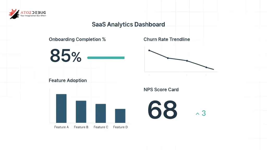
UX metrics are of two types: Qualitative metrics (like usability, loyalty, satisfaction) based on feedback, and Quantitative metrics (like retention, churn, task success) based on behavior.
Tracking these helps improve the overall customer experience.
| Metric | What Does it Mean? |
| Time per task | TPT shows how quickly users can complete a task. Shorter times usually mean smoother workflows and an intuitive design. |
| User error rate | It tracks how often users make mistakes while using the product. A high error rate may point to unclear navigation or poorly designed features. |
| Customer retention rate | It measures how many customers keep using the app over time. Good UX keeps users coming back. |
| Customer churn rate | It shows the percentage of customers who stop using the app. Poor UX is a common driver of churn. |
| Customer satisfaction score (CSAT) | CSAT reflects user happiness with specific interactions. A higher score usually means the experience is easy and enjoyable. |
| Customer effort score (CES) | CES captures how much effort users need to put in to complete tasks. Lower effort indicates a smoother, more efficient UX. |
| Net Promoter Score (NPS) | NPS gauges how likely users are to recommend the SaaS to others. Strong UX directly boosts advocacy and referrals. |
Best Practices for SaaS UX Design
If you want to build a strong UX for any SaaS application, you need a user-first approach.
Key best practices include:
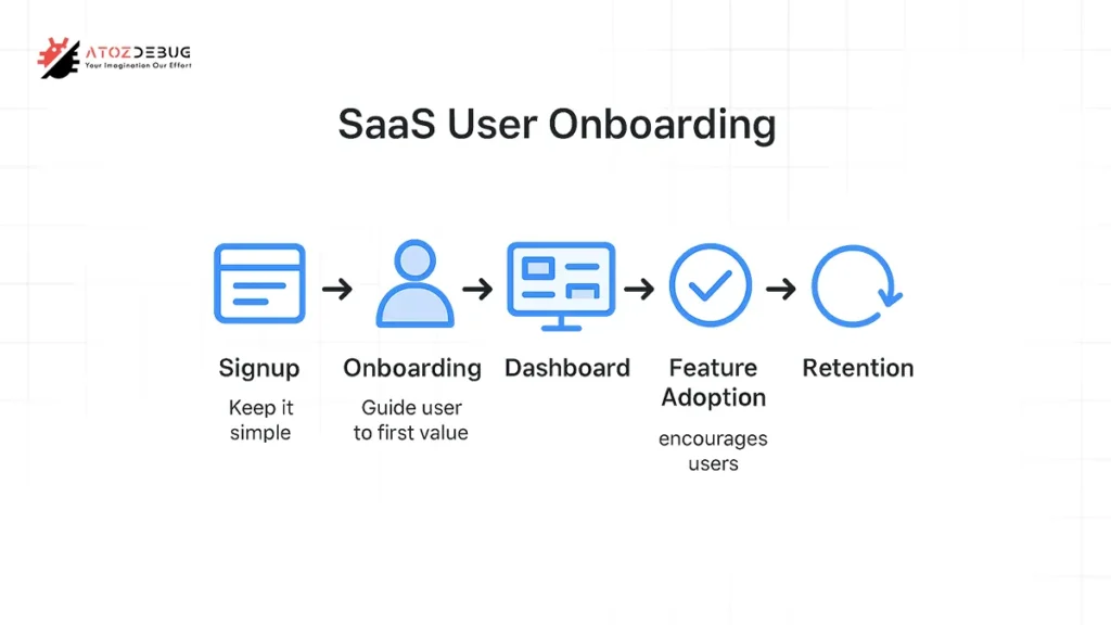
Design for First Success: First of all, identify the smallest action that proves value and design the path to it. Make that action frictionless.
Simplify registration and reduce friction: Ask only for essentials and offer social SSO and progressive profiling so you don’t interrupt the user’s momentum.
Personalize onboarding: Use early inputs (role, goal) to tailor flows and highlight relevant features.
Progressive disclosure: Show only what’s necessary now and reveal advanced options as users grow.
Clear information architecture: Logical, role-based navigation prevents confusion for admins vs. end-users.
Provide contextual help and self-serve resources: Inline tips, short videos, searchable docs and an in-app help center reduce churn.
Use analytics + session replays: Track funnels and watch screen recordings to find friction (rage clicks, unexpected drop-offs).
Micro-interactions & feedback states: Small, timely animations and confirmations reduce user doubt and clarify system state.
Accessible by default: Build with accessibility (WCAG basics) so all users can succeed; accessibility reduces support load and broadens market reach.
Regular usability testing: Run short tests with representative users every release cycle and iterate fast.
Measure and iterate on KPIs: Connect UX changes to TTV, activation, and churn metrics and iterate based on data.
Scaling UX for Growing SaaS Products
For SaaS products, good UX isn’t only about how the screens look. The system behind it also matters a lot. Important considerations include:
1. Managing Feature Bloat: As SaaS products grow, it is tempting to keep adding features. But if old or unused ones aren’t removed, the interface can feel messy and the product may slow down. A clear process to review and retire underused features keeps the product better.
2. Consistency with Design Systems: To scale design across many teams, a solid design system is key. Using shared elements like colors, spacing, and components keeps the product consistent while helping teams work faster.
3. Iterative Improvements: In SaaS, UX is never ‘finished.’ Companies like Atlassian run usability tests every sprint to refine navigation and reduce task times by up to 20%, proving that continuous iteration directly improves user adoption. The best way to improve is by testing small ideas, learning from the results, and making gradual updates. This helps the product grow safely over time.
4. Clear Dashboards: The first screen after login sets the tone. Dashboards work best when they highlight recent activity and next steps, tailored to each role. This prevents users from feeling lost.
5. Continuous Feedback Loops: Analytics show what users do, but direct feedback explains why. Combining usage data with surveys and in-app feedback gives a complete picture of where UX needs attention.
6. Event Instrumentation and A/B testing: Critical user paths like signup, first project creation, or payment should be tracked carefully. Setting up A/B tests makes it easier to check if changes work well before sharing them with all users.
Case Studies / Examples
1. Slack – Smooth Onboarding
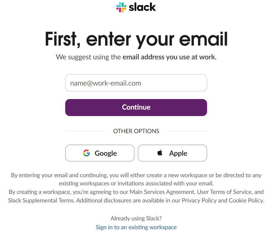
Problem: New team collaboration tools often overwhelm users with settings.
Solution: Slack keeps signup and workspace setup simple. Rather than showing everything at once, it guides users step by step. New members can join a team and start chatting right away without dealing with complex settings. This cuts confusion and helps people get started faster.
Impact: Slack reported that 93% of new teams sent their first message within the first day, drastically reducing early churn.
Notion – Modular and Customizable UX

Problem: Productivity apps often force users into rigid workflows.
Solution: Notion offers a blank page along with templates and modular blocks. This flexibility works well for both beginners and advanced users. Simple defaults make it easy to start, while templates help teams scale smoothly. Its growth into a full platform shows how modular UX and community templates can drive success.
Impact: This flexibility helped Notion grow from 1M users in 2019 to over 30M in 2022, fueled by its customizable UX.
Dropbox – Simple Referral + Clean Flows
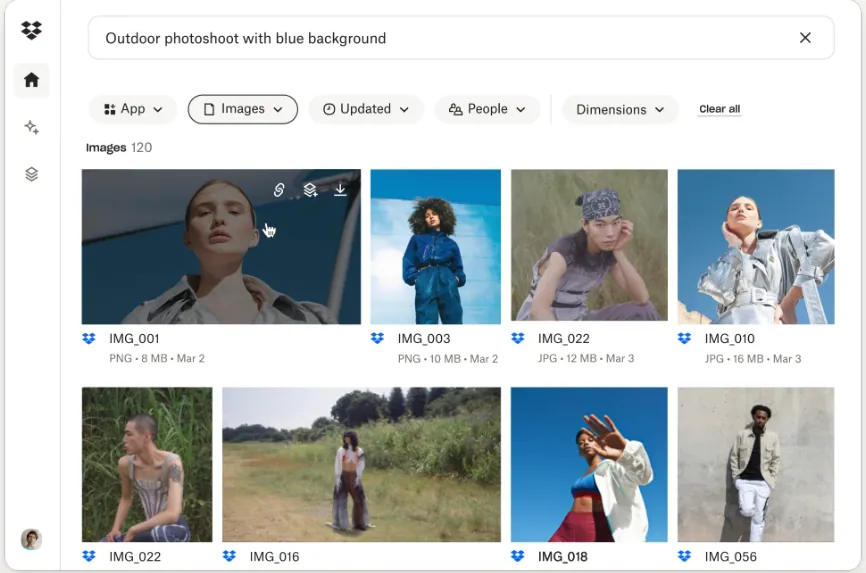
Problem: File-sharing was cluttered with complicated upload processes.
Solution: Dropbox kept file sharing simple and paired it with a referral program that rewarded users for inviting friends. That mix of a smooth core experience and word-of-mouth growth led to massive adoption in its early years. The case shows how simple flows and clear value often matter more than adding new features.
Impact: Their UX-driven referral campaign delivered a 60% increase in signups, helping Dropbox reach 4M users in just 15 months.
Zoom – One-click Access and Reliability
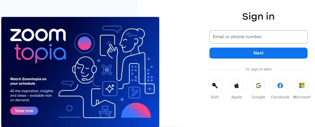
Problem: Traditional video conferencing tools required heavy downloads and multiple steps to join a call.
Solution: Zoom grew fast due to its easy meeting flow. Joining a call usually takes just one click. It focused on reliable video and audio first, while extras like backgrounds or breakout rooms stayed in the background. This shows how keeping the main task simple can drive growth.
Impact: In 2020 alone, Zoom scaled from 10M to 300M daily meeting participants, driven by frictionless UX.
Figma – Real-time Collaboration Made Simple
Problem: Design tools required constant saving and emailing files, slowing collaboration.
Solution: Figma became popular because it makes teamwork easy. Many people can work on the same design file at once without any complicated setup. Its clean interface, along with features like comments and seeing others’ cursors, makes collaboration smooth.
Impact: This collaborative UX made Figma the fastest-growing design tool, recently valued at $20B before Adobe’s acquisition attempt.
Common Mistakes in SaaS UX
As per the multiple studies, SaaS products often fail due to small but critical UX mistakes.
- Overcomplicated Onboarding: If new users struggle to understand the product from the start, they’re likely to leave. Keep it simple and guide them step by step.
- Feature Overload: Too many features on one screen can confuse people. Focus on what matters most and introduce advanced options gradually.
- Ignoring Mobile UX: Many users rely on phones for work. A poor mobile experience creates frustration and reduces engagement.
- Skipping testing and feedback: Without user feedback, teams often assume the design works. Usability tests and surveys highlight real issues early.
- Cluttered Dashboards: Crowded layouts make it hard for users to focus. Keep dashboards clean and highlight key actions.
- Unclear Navigation: If users cannot find what they need quickly, they lose patience. Clear menus and labels are essential.
- Inconsistent Design Patterns: Buttons, colors, and layouts should feel familiar across the platform. Inconsistency makes users doubt the product.
When you watch out for these mistakes while working on SaaS UX, you can create smoother experiences, improve retention, and build stronger trust with users.
Emerging UX Trends in SaaS
The way people use SaaS products is changing fast. Some key UX trends that companies are starting to invest in:
1. AI-driven Onboarding & Personalization
AI can walk new users through each step, recommend what to do next, or even set up features on its own. This way, people see value faster and are more likely to keep using the product.
2. Motion Design & Micro-animations
Small animations, like a button that bounces when clicked or a smooth loading bar, give users quick feedback and make the app feel more lively. When used wisely, they make navigation easier and the overall experience more enjoyable.
3. Dark Mode & Custom Themes
Many SaaS tools now let users switch to dark mode or change colors. This is not just about style; it reduces eye strain, especially for people who use the app for long hours, and lets teams match the tool with their brand.
4. Voice & Natural Language Interfaces
Typing is not always the fastest option. Voice commands and chat-style inputs are making it easier to search, take notes, or complete tasks quickly. This also improves accessibility for users who rely on assistive technology.
5. Accessibility-first Design
Accessibility is no longer optional. Designing with screen readers, color contrast, and keyboard navigation in mind ensures that everyone can use the product. It also helps companies stay compliant with regulations.
6. Adaptive Interfaces & Contextual Help
Some products are starting to adjust their layout and features based on a user’s skill level. Beginners see simpler options, while advanced users get more control. Event-driven help, like a tip that pops up only when someone seems stuck, is also becoming common.
7. AI-assisted Micro-Interactions
Beyond onboarding, AI is starting to shape small but important interactions. For example, predicting what a user might type in a search bar or suggesting the most likely next step in a workflow. These small touches save time and make the app feel smarter.
Conclusion
The best SaaS products succeed not because they have the most features, but because they make life easier for users. A smooth, intuitive experience keeps people engaged, reduces customer attrition, and builds trust over time. So UX should never be considered a secondary consideration; it’s the foundation of sustainable growth.
At ATOZDEBUG, we’ve made UX one of our top priorities when developing SaaS solutions. By focusing on clarity, usability, and continuous improvement, we help businesses deliver products that people actually enjoy using.
Frequently Asked Questions (FAQs)
Q1. Should SaaS companies invest in UX design?
Yes, investing in UX design is a must for SaaS companies. With well-designed products, they make their offerings easier to use, attract more customers, and stay ahead in the market.
Q2. How fast can UX reduce churn?
Even small fixes like improving signup or onboarding can reduce customer drop-offs within a few weeks. But the real revenue impact usually shows up after one to three billing cycles. Focus on early user experiences first to get quicker results.
Q3. How is SaaS UX design different from traditional design?
SaaS UX design is all about building scalable experiences for subscription-based apps, where the user journey needs to be smooth and updates are made regularly. And, traditional design usually focuses on products that are used once.
Q4. Can AI replace UX designers in SaaS product design?
No. AI can assist by automating personalization or generating design suggestions, but strategic decisions, user empathy, and creative problem-solving still require UX designers.
Q5. How much should a SaaS company spend on UX?
It depends on the company’s stage. Early-stage teams should allocate product/design cycles to core flows. Growth-stage companies often spend 5–15% of product resources on user research and design. The ROI on UX is widely reported to be high for meaningful investments.
Q6. What common mistakes in SaaS UX design cause retention?
A difficult onboarding process is one of the biggest issues. Other mistakes include having an inconsistent design, not personalizing the experience, and overlooking user feedback.
Q7. How to create SaaS UX design?
Good SaaS UX begins with knowing your users and building clear, easy-to-use flows. At ATOZDEBUG, we focus on creating user-friendly and scalable designs. Our goal is to make your SaaS app valuable, simple, and engaging, while ensuring quality at every step.
References: